
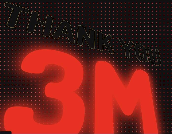
Here is a beautiful example of HTML and CSS to show animated Thank You Message in HTML and CSS for the followers achieved.
Animated Thank You Message in HTML and CSS
HTML Code:
THANK YOU
<SPAN>3M</SPAN>
FOLLOWERS

<link href="https://fonts.googleapis.com/css2?family=Dosis:wght@800&display=swap" rel="stylesheet">
CSS Code:
html {
  --color: red;
  display: grid;
  place-items:center;
  min-height: 100vh;
  font-family: 'Dosis', monospace;
  font-weight: 900;
  font-size: 10vw;
  text-align: center;
  background: radial-gradient(circle, var(--color) 2px, #111 2px);
  background-size: 20px 20px;
  color: #111;
  text-shadow:
    0 0 1px gold,
    0 0 1px gold,
    0 0 1px gold,
    0 0 1px gold,
    0 0 1px gold,
    0 0 10px black;
  perspective: 600px;
  animation: colorSwap 2s linear infinite;
}

body {
  animation: tilt 10s linear infinite;
}
@keyframes tilt {
  25% { transform: rotateX(25deg) rotateY(25deg); }
  50% { transform: rotateX(25deg) rotateY(-25deg); }
  75% { transform: rotateX(-25deg) rotateY(25deg); }
}

span {
  display: block;
  font-size: 30vw;
  line-height: 75%;
  color: transparent;
  text-shadow:
    0 0 1px var(--color),
    0 0 50px var(--color),
    0 0 100px var(--color);
  animation: colorSwap 2s linear infinite;
}
@keyframes colorSwap {
  25% { --color: cyan; }
  50% { --color: magenta; }
  75% { --color: lime; }
}
Output:
Created by Kit Jenson. See live https://codepen.io/kitjenson/pen/KKqRzOP


